A rebrand isn’t just a new coat of paint. It’s a chance to hold a mirror up to your mission and ask: “does this look like who we really are?” Here at Cloverleaf, the answer was clear: we’ve leveled up, and it was time for our brand to do the same.
Why Cloverleaf Rebranded: A Mission to Build Better Connections
Our mission has always been simple: help people build better connections at work. But the old look wasn’t pulling its weight. We needed something warmer, more trustworthy, more elevated. And, just as importantly, fully ADA compliant—because accessibility is non-negotiable.
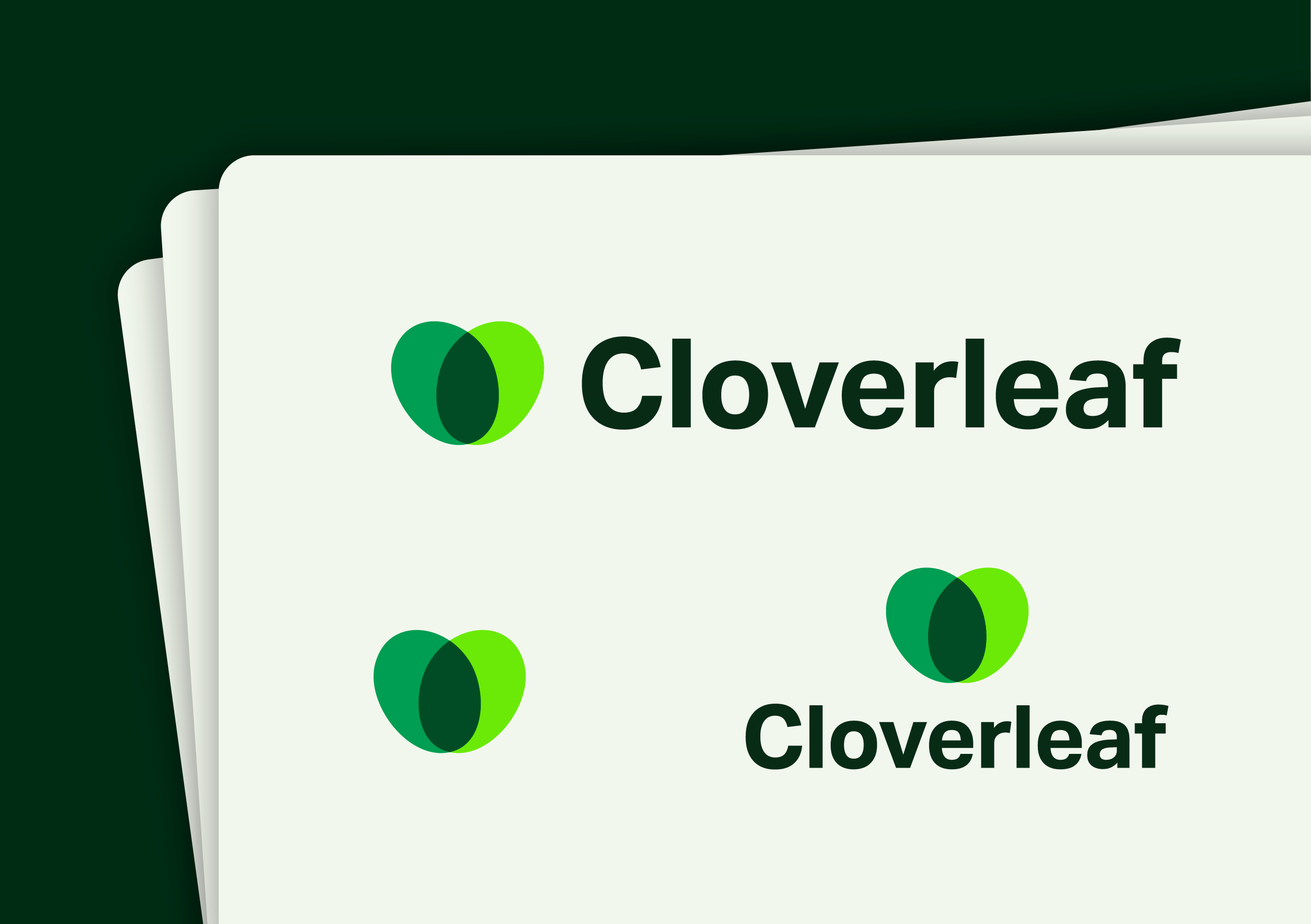
The Cloverleaf Logo: Connection as the Foundation for Growth
The Cloverleaf logo has always been about connection. We stripped it back to its essence: one clover leaf formed by two intersecting ovals. Simple, but intentional. Clarity over clutter. A single leaf that’s part of something bigger. A reminder that connection is where growth starts. It’s still us, just sharper, cleaner, and built to scale.
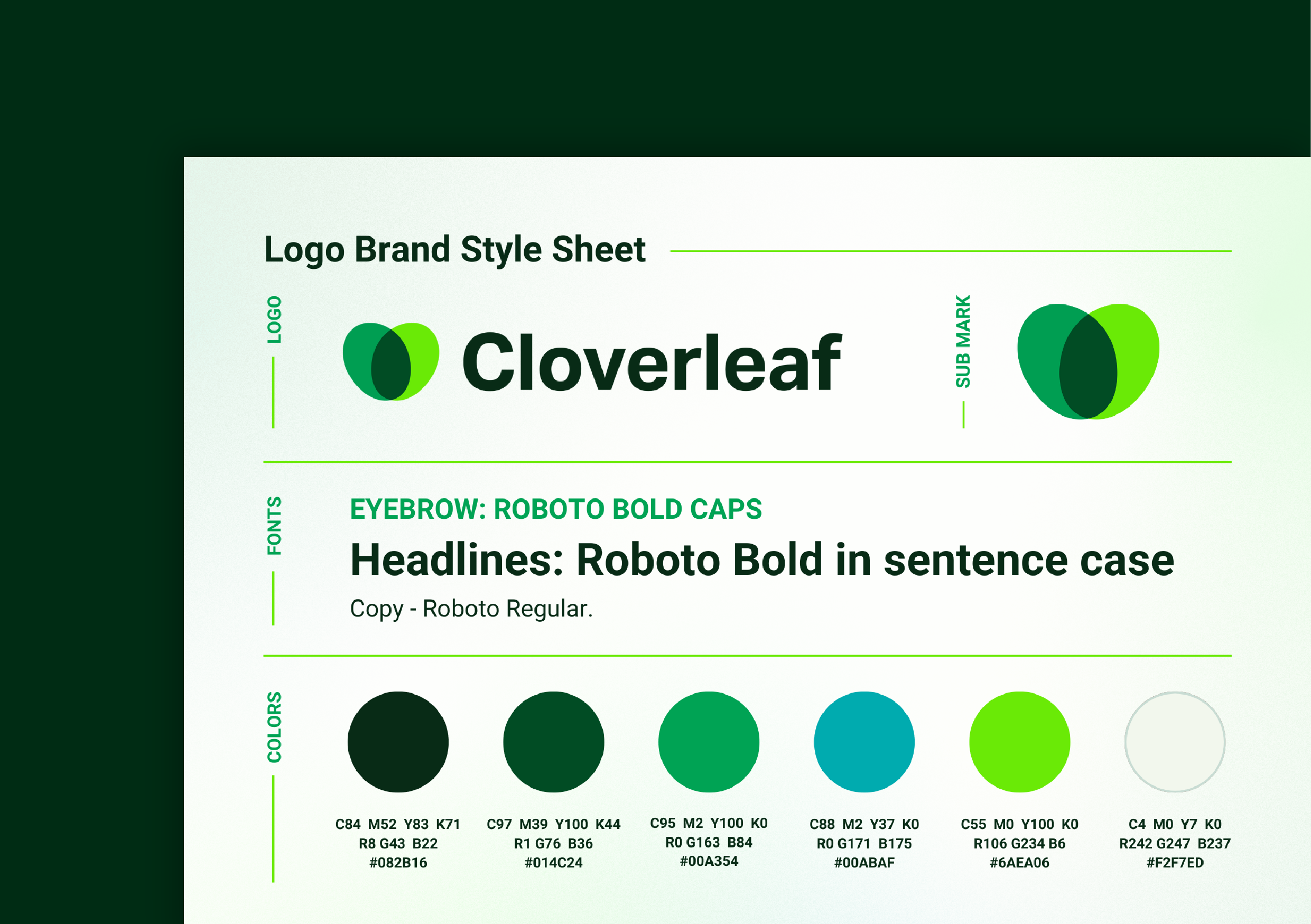
Cloverleaf Brand Colors: A Palette With Purpose
When thinking about the colors that would represent Cloverleaf and all we stand for, we knew we needed a bit of a refresh. We didn’t throw out our green. We refined it. Then we layered in depth, balance, and edge:

👉 Deeper greens for stability and trust.
👉 Blue for grounding and balance.
👉 Neon green (in small doses) to keep things fresh, tech-forward, and a little disruptive (in the best way)
The palette signals maturity without playing it safe. It’s confident, modern, and built to stand out in the boardroom and beyond.
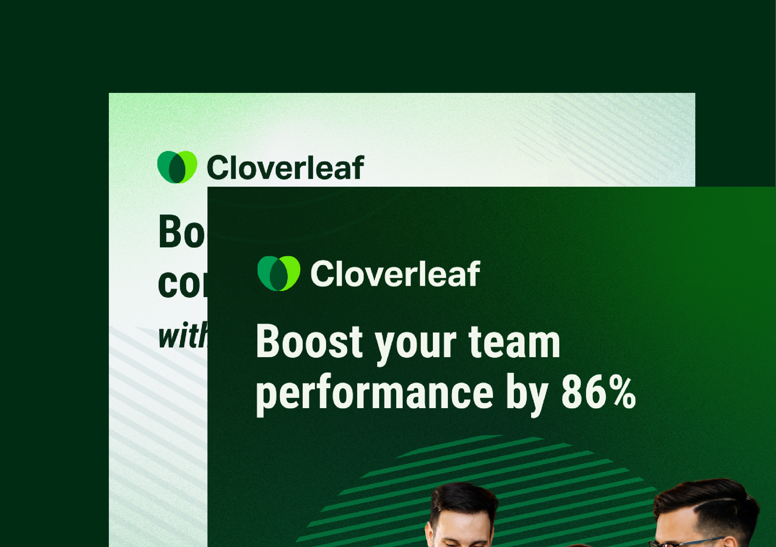
How the New Cloverleaf Brand Elevates Trust and Credibility
When you walk executives into Cloverleaf, you need a brand that instantly earns credibility. This rebrand was designed to do exactly that, while still keeping the humanity and approachability that makes teams lean in.
We’ve made it easy to bring the new brand into your conversations. Download our updated assets here.
Just as Cloverleaf Connect, Coach, and Assess unify data for growth, our brand unifies our story for the future of work.
Looking Ahead: Cloverleaf’s Brand and the Future of Workplace Connection
This isn’t just a refresh. It’s a statement: Cloverleaf is growing, evolving, and building tools that help people—and companies—connect better. Our brand now matches our mission to help you build better connections at work.